How Graphics Cards and Processors Impact Your Gaming Laptop Experience
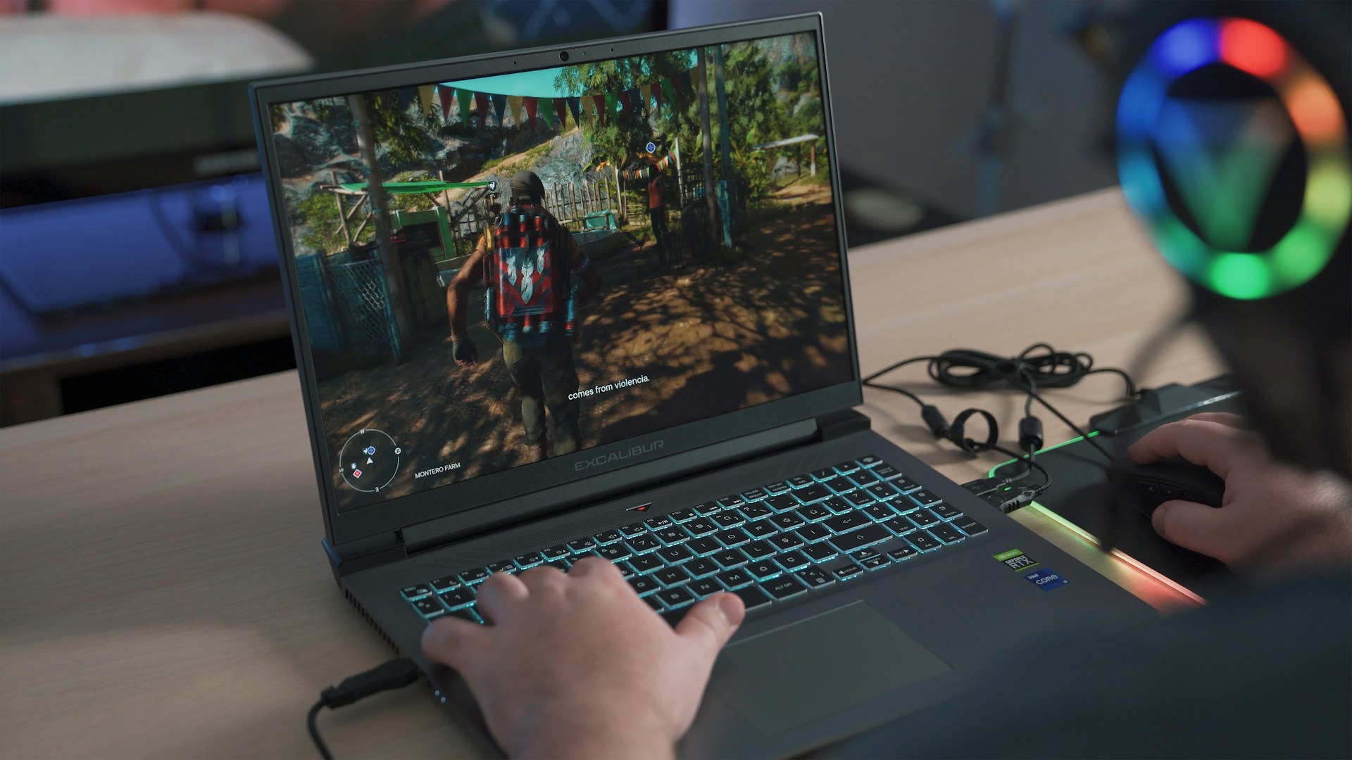
Gaming laptops have evolved dramatically over the past decade. Players now expect high performance, smooth visuals, and fast response times. Two components, graphics cards and processors, play a pivotal role in delivering this experience. The right combination ensures games run seamlessly and look impressive. Choosing the wrong hardware can lead to lag, lower frame rates, and frustration. Understanding how these components work together allows gamers to select a laptop that meets their expectations. This article explores how graphics cards and processors impact your gaming laptop experience.
Understanding Processors
Processors, or CPUs, manage overall system performance. They handle calculations, run programs, and coordinate data flow between hardware components. A fast CPU allows games to run efficiently, especially those with complex simulations or numerous in-game characters. While GPUs render visuals, the CPU ensures that game logic, physics, and AI operate smoothly. Choosing a balanced CPU that complements the GPU is essential for a consistent gaming experience. A weak processor can bottleneck a strong graphics card, reducing performance despite high-end visuals.
The Role of Graphics Cards

Graphics cards, or GPUs, handle rendering images, videos, and animations. In gaming, the GPU determines the quality of visuals and how smoothly games run. A powerful GPU processes complex graphics quickly, reducing lag and stuttering. Higher-end GPUs also support advanced features like ray tracing, which enhances realism. For gamers seeking immersive experiences, the graphics card is arguably the most crucial component. Investing in a strong GPU ensures games look sharp and perform reliably under demanding conditions.
How GPUs and CPUs Work Together
Gaming performance depends on the collaboration between the CPU and GPU. The CPU processes game instructions, while the GPU converts them into visual output. If either component underperforms, it affects the other. A high-end GPU paired with a weak CPU may result in lower frame rates or delayed responses. Similarly, a strong CPU with an entry-level GPU will struggle to render modern games effectively. Ensuring a balance between these components is key to achieving smooth, high-quality gameplay.
Impact on Frame Rates and Resolution
Frame rates and resolution are direct indicators of gaming performance. Higher frame rates create smoother gameplay, which is especially important in fast-paced or competitive games. Resolution determines the sharpness and detail of visuals. GPUs handle the bulk of rendering for high resolutions, while CPUs support overall processing demands. Upgrading either component can improve frame rates and resolution, but the most noticeable gains occur when both are optimized. Gamers should consider their preferred resolution and monitor refresh rate when selecting hardware.
Thermal Performance and Efficiency
Gaming laptops generate significant heat, especially during intensive sessions. GPUs and CPUs are major contributors to thermal output. Efficient cooling systems are necessary to maintain performance and prevent throttling. Overheating can reduce frame rates and shorten hardware lifespan. Modern laptops often include thermal management solutions that balance performance with quiet operation. Understanding thermal performance ensures a laptop can sustain high-level gaming without compromising stability or comfort.
Future-Proofing Your Laptop

Selecting the right GPU and CPU also impacts the laptop’s longevity. Games are becoming more demanding each year, and hardware needs to keep up. Investing in high-quality components can extend the usable lifespan of a laptop. Future-proofing means the system can handle upcoming releases without immediate upgrades. Gamers who anticipate longer use should prioritize GPUs and CPUs that exceed current requirements. This strategy ensures a smoother experience as games evolve in complexity and visual fidelity.
Other Factors Influencing Gaming Performance
While GPUs and CPUs are critical, other elements also affect performance. RAM, storage type, and display quality contribute to the overall experience. Faster SSDs reduce load times, while sufficient RAM allows multitasking without slowdowns. Display refresh rates and color accuracy enhance visual enjoyment. Optimizing these elements alongside the GPU and CPU ensures a comprehensive gaming experience. Paying attention to the full hardware ecosystem creates a laptop that feels responsive, immersive, and enjoyable.
Graphics cards and processors are at the heart of a gaming laptop’s performance. GPUs determine visual quality and frame rates, while CPUs manage game logic and overall system coordination. Their interaction defines the smoothness, responsiveness, and realism of gameplay. Balancing these components ensures that neither bottlenecks the other, providing an optimal gaming experience. Thermal management, future-proofing, and complementary hardware like RAM and storage also contribute to satisfaction. Understanding how GPUs and CPUs impact gaming allows players to choose laptops that meet their performance expectations and deliver a unique, immersive experience.…


 Let’s talk about clarity. Your button text should be concise and clearly convey the action you want users to take. Avoid vague language like “Click Here” or “Learn More.” Instead, opt for specific phrases that describe the desired outcome, such as “Get Started,” “Claim Your Free Trial,” or “Buy Now.” In addition to clear text, contrasting colors can’t be overlooked thanks to its ability to attract attention to your CTA button.
 Even if your website has such a beautiful CTA button, without the power of copywriting, it will be just a waste. Indeed, the words you choose to use can make or break the success of your call-to-action design. To begin with, keep your copy concise and persuasive. Use strong action verbs that prompt immediate action from your audience. In addition, personalize your copy to create a sense of urgency and exclusivity.

 API booking software is an online service that allows businesses to book appointments with potential customers. These can be physical or virtual (phone, email) meetings for various industries, including marketing agencies and beauty salons. The system also manages all communication between customers and the scheduling team, as well as checks availability.
 One of the many benefits of using a booking system is that employees can access the information from anywhere. It will allow businesses to double their productivity while providing flexibility for both employers and employees alike. Apart from this, it provides security with its multi-level authentication processes, so you know your data won’t be compromised in any way. This is why many businesses are switching to API booking software. Each day the number of companies using the software is increasing. It is because the software offers many benefits that other systems cannot provide.


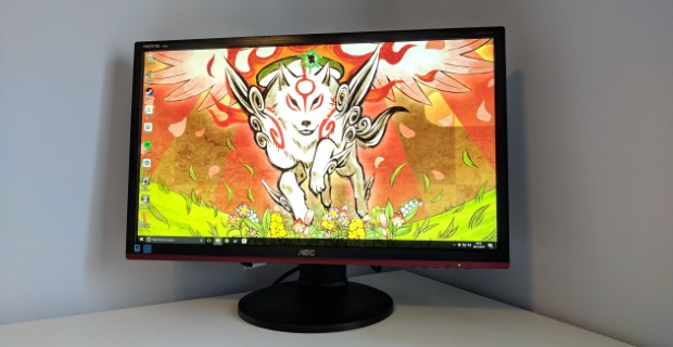
 A good gaming monitor should come with enough ports. You need to connect external devices to the monitor so it is important for the gaming monitor should have enough ports.
 Mobile banking applications are meant for people from all walks of life and different educational backgrounds. You do not need to visit any school to learn how to use these applications. They are designed in a simple way making it easy for anybody to use. They do have a menu button with the different services listed. You should download your bank’s mobile app to enjoy the experience.